
Comparing Areas
Overview
There are two ways to compare, and they answer different questions.
- Compare small areas puts every small area inside ONE forecast side by side. Use it to see how the parts of your own council differ from each other.
- Compare any areas lets you choose the areas yourself, from any forecast you have access to. Use it to compare scenarios, to see what a data update has changed, or to put your forecast beside a publicly listed one.
Both are available for all data. The sections below cover Compare small areas first, then Compare any areas.
Switching between the focuses
Choose the Focus button, which shows the focus you are on (for example “Focus: Single area”), to open a dropdown with three options:
- Single area: the standard view, showing data for the whole forecast area as one line
- Compare small areas: one line or shape per small area within this forecast
- Compare any areas: one line per area you pick yourself, from any forecast you have access to
The focus you are on is highlighted and cannot be chosen again. Choosing either of the others takes you straight to that view of the data you are already looking at, so you keep your place.
Tick Keep focus across pages and the forecast menu takes you to the same focus on every other page that has one.
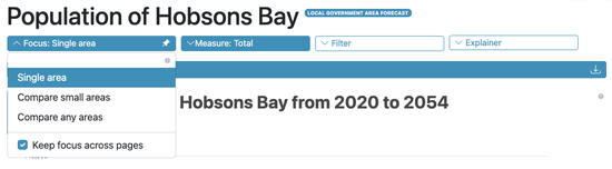
The Focus control open, showing all three focuses
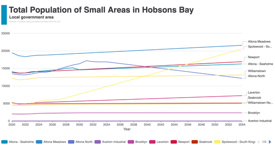
Total chart when comparing small areas, each area in its own colour
Total chart when comparing small areas
The total chart shows a trend line for each small area over the projection years. Each area is assigned a distinct colour, and area names appear in the legend on the right.
Choose any legend entry to show or hide that area’s line, a quick way to concentrate on a few areas without leaving the page.
Hover over the chart to see values for all areas at a given year. Use the download icon to save the chart as an image.
Total chart on a small area forecast
When you are viewing a small area forecast, the total chart changes. The small area you are on appears as a bold dark blue line, while the others are drawn in light blue behind it.
The background lines give context: you can see at a glance whether the area you are on is growing faster or slower than the rest. To bring another area forward, choose a different small area from the small area selector in the main navigation bar.
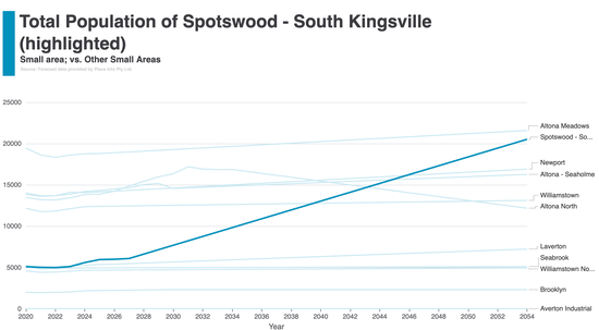
Total chart for a small area forecast, selected area in dark blue, all others in light blue
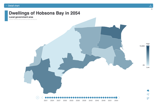
Detail chart when comparing small areas, as a choropleth map
Detail chart when comparing small areas
The detail chart shows the spatial distribution of values for a selected year. Three views are available, switchable via the toolbar icons in the bottom-right corner of the chart:
- Choropleth map: areas shaded by value intensity on a geographic base map. Darker shading indicates higher values.
- Dorling cartogram: circular bubbles scaled by value, positioned approximately by geography.
- Demers cartogram: square tiles scaled by value, arranged to minimise overlap while preserving rough geographic positioning.
A legend on the right shows the value scale. Use the timeline at the bottom to step through the years, or its play button to animate through them.
Choosing a cartogram view
Both cartogram views retain geographic positioning. If a small area is in the north of the forecast, its circle or square also appears in the north. The shapes are scaled by demographic value but not moved across the map, so spatial relationships between areas are preserved.
The Dorling cartogram uses circles scaled by value. Smaller areas that are hard to see on the choropleth map become more visible when their bubble size reflects their demographic weight.
The Demers cartogram uses squares arranged to minimise overlap. It is useful when many small areas are clustered together, as the non-overlapping layout makes individual values easier to read.
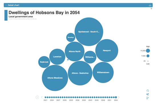
Dorling cartogram, circular bubbles sized by value, positioned geographically

Demers cartogram, square tiles sized by value, arranged to minimise overlap
Choropleth or cartogram?
This choice belongs to Compare small areas, which is the only focus offering a choropleth map. The choropleth map and the cartograms serve different purposes, so the choice depends on what you want to understand.
The choropleth map preserves the actual geographic shape and size of each area. Use it when location matters, for example to see whether high-growth areas form a contiguous cluster, or whether values differ between neighbouring small areas.
Cartograms rescale areas by their demographic value rather than their physical footprint. This makes areas with large demographic weight visually prominent, even where they are physically small on the map. Use a cartogram to compare values across areas without the small ones getting lost.
Choosing between Dorling (circles) and Demers (squares) is largely a matter of taste: both show the same information with the same geographic positioning. Circles tend to look cleaner when areas vary widely in size; squares pack more tightly and can be easier to read when many areas have similar values.

"Link charts" checkbox, synchronises hover interactions between total and detail charts
Linking the two charts
The link charts checkbox, between the total and detail charts, synchronises the two when it is ticked:
- Hovering a year in the total chart updates the detail chart to show that year’s distribution.
- Hovering an area in the detail chart highlights that area’s line in the total chart.
This makes it easy to trace how a spatial pattern in a given year corresponds to the long-term trend for each area. It works in both comparison focuses, wherever a detail chart is shown.
Filtering which small areas to compare
The Filter panel works here exactly as it does on any other page, with the same sections and the same behaviour. Whatever you filter to applies to every area on the chart at once.
On a Compare small areas page it carries one extra section, Small areas, which chooses which of them to compare. By default All is selected and every small area is included in both charts.
Choose Specific to narrow it to a subset:
- Choose any area on the interactive map to toggle it.
- Use the button grid to toggle individual areas, or All / None for the lot.
- The selection count is shown, for example “3/11 selected”.
Tick Keep filters across pages to carry that selection with you as you move between comparison pages.
Compare any areas has no Small areas section in its Filter, because the areas on that chart are chosen in the area picker instead. Everything else in the Filter behaves the same there.
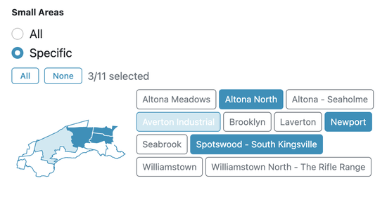
The Filter panel’s Small areas section, which chooses which small areas to compare
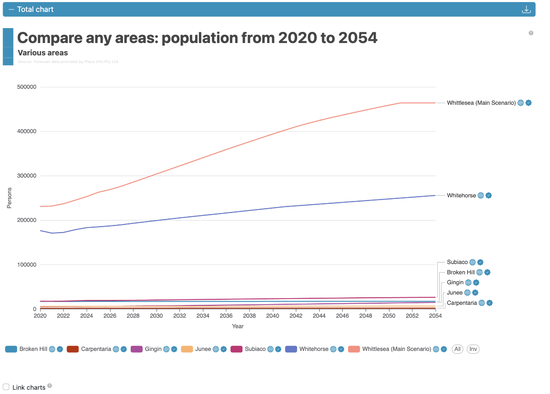
The total chart with all seven publicly listed forecasts on it, from Whittlesea to Carpentaria
Compare any areas
Everything above describes Compare small areas, which always shows every small area in the forecast you are looking at. Compare any areas lets you choose instead: which areas, from which forecasts, on one chart and one table.
Three things it is commonly used for:
- One scenario against another. Put high growth beside low growth and read the gap directly, on population, on dwellings, on any of the data pages. More about scenarios.
- Your active forecast against your pending one. When the ABS releases a new estimated resident population (ERP), your pending forecast is rebuilt on it while your active one stays on the data your current plans are built on. Putting the two side by side shows what the new release does to your numbers, area by area, before you decide whether to make the pending forecast active. More about active and pending forecasts.
- Your forecast against a publicly listed one.
You can mix levels freely: a whole local government area against another, one small area against another, or a council against a few of its own small areas. Up to 40 areas at once.
Choosing areas with the area picker
Compare any areas has its own control, the Area picker bar above the chart, rather than the Filter panel used for small areas. It lists one row per forecast, with that forecast’s small areas folded underneath, so you open only what you need. Choose the caret beside a forecast to open it, or search by area or forecast name.
A forecast opens by itself when you search for something inside it, or when one of its small areas is already on the chart.
Tick the areas you want, then choose Apply to redraw the chart. Nothing changes until you do. The plus button on a row takes that whole branch at once, and the number beside it says how many it will tick.
Every row carries its forecast’s status marks, the same ones shown on that forecast’s badges: whether it is public or internal, whether it is active or still pending, and whether it is a demonstration or test forecast. They are what tells two forecasts of the same name apart. A forecast’s scenario name, where it has one, is part of its name in the list.
Your selection is stored in the page address, so you can bookmark a comparison or send the link to a colleague and they will open exactly what you were looking at.
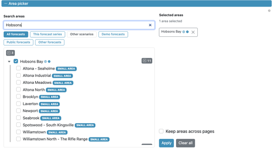
The area picker, with a search narrowing the list and one forecast opened to show its small areas
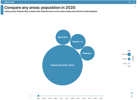
The detail chart as a Dorling cartogram, sized by population. There is no choropleth map in this focus
The charts when comparing any areas
The total chart works exactly as it does for small areas: one line per area, a legend you can choose entries in, and hover for the values in a given year.
The detail chart differs in two ways worth knowing:
- There is no choropleth map, only the Dorling and Demers cartograms. The same place can be chosen twice here, a council and one of its own small areas, and a choropleth map has only one position per place.
- It is not shown at all for rates, averages and densities, or in the Change measure. A cartogram sizes each area by magnitude, and a sum of rates or of densities is not a quantity that can size anything. The table below the chart carries every area’s value in those cases.
Keeping areas across pages
Tick Keep areas across pages in the area picker and your selection comes with you to the other Compare any areas pages, so you can follow the same areas from population to births to dwellings.
To open those pages in the first place, tick Keep focus across pages in the Focus control as well. That one decides which focus the forecast menu takes you to, and this one decides which areas are on it. While either is on, its control carries a small mark in the form of a pin, so you can see it is kept without opening the control.